Spanning multiple rows and columns
Spanning rows and columns is a standard HTML feature and exists for decades already. Be sure not to overuse them though, as they can be a bit tricky for screen readers, especially in complex data tables. And in general: keep your tables simple.
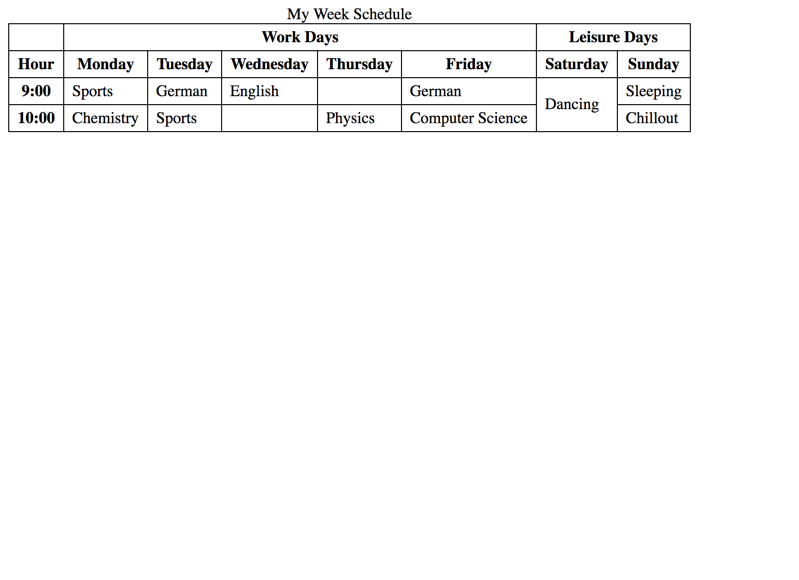
Take a look at the following data table example showing a week schedule. It groups work days and leisure days together using colspan. Also, while most data cells span exactly one row, a sigle one (Dancing) spans two rows using rowspan.
Navigate the table with a screen reader using table navigation. Do you notice any possible problems?
Table spanning multiple rows and columns
Well, most of the table is announced very well by the screen reader. But as soon as cells span multiple rows or columns, it is getting a bit tricky - if not to say: confusing.
Tricky screen reader navigation
Link to heading "Tricky screen reader navigation"The first thing to note is that NVDA does not announce when a cell spans multiple rows or columns! For example, the header cell "Work Days" (which spans 5 columns) is simply announced as "column 2 Work Days", and the next cell "Leisure Days" (which spans 2 columns) is announced as "column 7 Leisure Days". Did you notice the jump from 2 to 7? You have to be a pretty focused user to realise this.
The same holds true when navigating vertically. For example, when navigating from "Saturday" down to "Dancing", there is no hint by the screen reader that "Dancing" spans both "9:00" and "10:00", it only announces "9:00 row 3 Dancing". As there is no subsequent row (if it existed, it would be announced as "row 5", again with a jump from 3 to 5), not even vigilant users have the chance to realise by accident that "Dancing" spans 2 rows.
And one last thing to note: finding the cell "Chillout" is not that easy using a screen reader! If you are on the last row ("10:00") and then navigate from "Computer Science" rightwards to "Dancing" and then again to the right, then you will end on "Sleeping" which in fact is one row above! Sure, the screen reader announced the jump from row 4 to row 3 when coming to "Dancing", but still you have to be very vigilant to realise. So in fact, you only are able to reach "Chillout" by navigating down from "Sleeping".
What does this mean for developers?
Link to heading "What does this mean for developers?"In our opinion, this all clearly are shortcomings of screen readers, as the HTML code is perfectly clean and unambiguous - and tables are a feature that exists for decades already! Still, we advise not to overuse rowspan and colspan and to keep data tables simple - in the end, all users will be thankful.