Marking elements activatable using aria-pressed
ARIA provides an attribute which allows to mark an element as activatable. It works pretty uniformly in modern browsers and screen readers. Still, for most situations there exist alternative techniques that are more robust.
Background
Link to heading "Background"In modern web applications there are often situations where the user needs to be able to toggle an element's activity.
On a visual level, this status typically is indicated using icons, for example a "play/pause" icon for an audio player. But this information needs to be available also on the semantical level, so screen readers can announce it.
Intended use
Link to heading "Intended use"On a semantical level, the aria-pressed attribute is a good choice to convey that an element's visibility can be activated, together with its current state:
<button aria-pressed="false">
  Toggle
</button>
A screen reader will announce:
Toggle. Button not pressed.
If the button is activated (and the aria-pressed status is changed to true by JavaScript), the screen reader will announce this change:
Pressed.
Marking an element togglable using aria-pressed
Real world use
Link to heading "Real world use"As shown above, if the button's aria-pressed value is changed using JavaScript while it is focused, screen readers announce the change. This is pretty exceptional, as most other changes to an element are not detected by screen readers (and as such not announced).
In line with the requirement that every user interaction must result in an adequate feedback (see How to implement websites that are ready for screen reader usage), the aria-pressed attribute may seem really useful for elements like that toggle something, for example a "Play audio" button.
But in fact, there is an even simpler and more robust way to implement this using a checkbox.
Alternative technique using checkbox
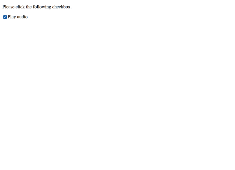
Link to heading "Alternative technique using checkbox"Instead of fiddling around with ARIA, you can achieve the same result using a traditional checkbox (styled to your likings).
Marking an element toggleable using a checkbox
While this is even more robust than using aria-pressed, it may feel out of place within a "real" form.
Do not confuse with aria-selected
Link to heading "Do not confuse with aria-selected"There is another, similarly appealing ARIA attribute called aria-selected: it can only be used together with certain roles (for example role="tablist") and as such should not be confused with aria-pressed.
Do not use for marking expandability
Link to heading "Do not use for marking expandability"If you need to mark that the visibility of an element can be toggled, instead of aria-pressed, you should use aria-expanded, see Marking elements expandable using aria-expanded.
Conclusion
Link to heading "Conclusion"If you need to describe the activatable status of interactive elements, aria-pressed is one of the few ARIA attributes we can recommend for general use. The alternative technique using a checkbox may be even more robust though (especially outside of forms).
In the end it is up to you what technique you choose.